

Also Read: Coca-Cola unveils new global look
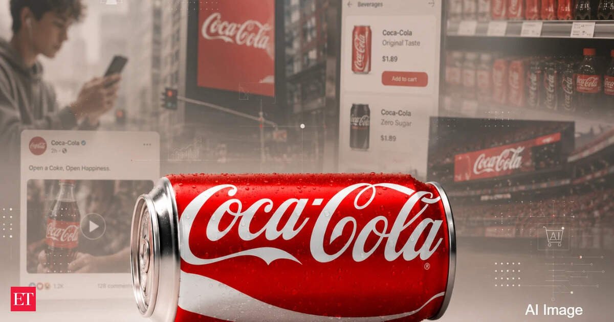
The company describes the initiative as a visual evolution built around its most iconic assets, including the Spencerian script, the Dynamic Ribbon, the Arden Square and the familiar red-and-white colour palette. But viewed through a business lens, the project is really about ensuring that every Coca-Cola experience, whether on a supermarket shelf, a delivery app, a social media feed or a stadium screen, reinforces the same brand associations. In an era when consumers are bombarded with choices and content, Coca-Cola is trying to make its brand work harder and more efficiently than ever before.
A response to a more challenging growth environment
Coca-Cola remains one of the world’s most powerful consumer brands, but the company faces a very different business environment than it did a decade ago. Across many developed markets, traditional carbonated soft drinks are mature categories. Consumers are increasingly interested in lower-sugar beverages, functional drinks, hydration products and wellness-oriented brands. The rapid growth of Coca-Cola Zero Sugar reflects these changing preferences, while new competitors continue to emerge across energy drinks, sports beverages and health-focused categories.

At the same time, consumers in many markets have become more price sensitive after years of inflation. Coca-Cola has been able to grow revenue partly through pricing, but maintaining pricing power over the long term depends on preserving the strength of the brand itself.
Also Read: Coca-Cola appoints JPMorgan, Citi for India bottler IPO, sources sayThat can explain why the company has chosen to invest in a global identity refresh now.
In the company’s announcement, Arnab Roy, President of Coca-Cola Global Category, said the objective was to create “a stronger foundation for growth while staying unmistakably Coca-Cola.” The company is not redesigning itself because consumers no longer recognise Coca-Cola. It is doing so because future growth increasingly depends on extracting maximum value from the brand equity it already owns.
Solving the problem of brand drift
One of the most insightful explanations of the project comes from Tosh Hall, Global Chief Creative Officer at JKR, the agency behind the redesign. “When you’re 140 years old, operating across every market and every touchpoint, small inconsistencies creep in,” Hall told Creative Bloq in an interview recently. Over time, he said, “the brand in people’s heads and the brand as it actually exists” can drift apart.
Also Read: Cracks in cola kingdom: India’s duopoly faces biggest test in decades
For a company operating in more than 200 markets, that drift creates real business consequences. Every variation in packaging, retail execution, digital advertising or local marketing weakens the consistency that helps consumers recognise and trust the brand and be willing to pay more when cheaper alternatives exist. Individually those inconsistencies may seem minor. Collectively they can reduce the effectiveness of billions of dollars in marketing investment.
Hall said the agency’s task was to identify “the most distinctive version of every element” and ensure it appears with the same clarity everywhere, he told Creative Bloq.
In practical terms, Coca-Cola is trying to reduce the gap between the idealised brand consumers remember and the version they encounter in the marketplace. The more consistently the company can deliver that experience, the more efficiently its marketing spending works.
Protecting pricing power through brand strength
The refresh also arrives at a time when pricing has become one of the most important issues in the consumer goods sector. For several years, major food and beverage companies have relied heavily on price increases to offset inflation and protect profitability. The challenge is that consumers eventually begin questioning whether a premium brand still deserves a premium price.
Strong brands maintain pricing power because consumers perceive them as different, familiar and trustworthy while weak brands are like commodities.
Coca-Cola’s new visual system can be seen as an effort to reinforce the mental shortcuts that drive purchasing decisions. Every time consumers encounter the familiar script, the distinctive ribbon or the iconic red colour, they are reminded why Coca-Cola occupies a unique position in the beverage market.
Rapha Abreu, Global Vice President of Design at The Coca-Cola Company, emphasised that the company was focused on strengthening assets consumers already know by heart. “Our job wasn’t to change what people love about Coca-Cola. It was to protect it, celebrate it and prepare it for the future,” he told Creative Bloq.
So, Coca-Cola is not trying to create new equity but to protect and compound existing equity.
Why Zero Sugar matters to the strategy
One of the most commercially significant aspects of the new identity concerns Coca-Cola Zero Sugar. The company has given Zero Sugar a more prominent visual treatment, including larger “Zero Sugar” text and a stronger black Dynamic Ribbon.
At first glance, these may appear to be packaging tweaks. In reality, they support one of Coca-Cola’s most important business priorities. Across many markets, Zero Sugar is one of the fastest-growing parts of the Coca-Cola portfolio. The company wants consumers to recognise the product immediately while also maintaining a strong connection to the core Coca-Cola brand.
Historically, many diet beverages developed identities that felt almost separate from their parent brands. Coca-Cola appears to be taking the opposite approach. The company wants consumers to see Zero Sugar as authentically Coca-Cola rather than as an alternative to Coca-Cola. A unified identity system makes that easier to achieve.
Building a brand for a world of screens
Another major driver behind the refresh is the changing nature of media itself. A generation ago, Coca-Cola’s visual identity primarily needed to work on packaging, billboards and television commercials. Today it must function across social media platforms, retail media networks, e-commerce sites, digital menus, connected devices and countless forms of online advertising.
“As consumer expectations, technology and media continue to evolve, the brand has to perform across more touchpoints than ever before while remaining instantly recognisable and memorable,” Abreu told Creative Bloq.
The challenge is not simply producing more content but to ensure that all of that content still feels like Coca-Cola. This is one reason the company repeatedly refers to the initiative as a system rather than a redesign. Systems are designed to scale and allow organisations to create large volumes of content without sacrificing consistency.
The hidden importance of the Dynamic Ribbon
For Dave Balsamello, Creative Director at JKR, the ribbon became one of the project’s most strategically important assets. “The ribbon especially was something that stood out,” Balsamello told Creative Bloq. He described it as an iconic element that felt particularly relevant in a world with “more screens, more surfaces, and more people interacting” with the brand.
Unlike a traditional logo, the ribbon can move, animate, stretch and adapt to different environments. It works on a bottle, a mobile screen, a retail display or a video advertisement. That flexibility makes it especially valuable in today’s media ecosystem, where brands increasingly need visual elements that can travel seamlessly across formats.
Designing for recognition rather than decoration
Balsamello said JKR tested every component of the identity to understand how far it could be pushed before it stopped feeling like Coca-Cola. “We took the identity apart, iconic element by iconic element, and stress tested everything,” he told Creative Bloq.cThose tests were not purely creative exercises but exercises in maximising brand recognition.
In today’s attention economy, consumers often spend only a fraction of a second looking at a package, an advertisement or a social post. The faster they recognise Coca-Cola, the more valuable every marketing impression becomes. For a company that spends billions of dollars annually supporting its brands, even small improvements in recognition can generate enormous returns over time.
The AI angle
Perhaps the most consequential aspect of the project has little to do with packaging at all. Alongside the new visual identity, Coca-Cola has introduced an updated Brand Center and new Design Intelligence tools intended to help internal teams and agency partners maintain consistency. The company says these tools support governance, quality and scalability across its global network.
That points to a challenge facing every major consumer brand — the explosion of content creation. Marketing teams now produce vastly more assets than they did even a few years ago. Increasingly, some of that content is being generated or assisted by AI tools. In that environment, clear systems become essential. A tightly defined visual framework helps ensure that whether content is created by a local marketer, an agency partner or an AI-assisted workflow, the output still looks and feels unmistakably Coca-Cola. What appears on the surface to be a design refresh may therefore be partly an exercise in future-proofing the brand for an AI-driven marketing ecosystem.
A business strategy expressed through design
The easiest way to misunderstand Coca-Cola’s new visual identity system is to see it as a cosmetic update. But it’s something much larger with long-term implications for Coca-Cola’s global business. The company is trying to increase the effectiveness of its marketing, strengthen pricing power, support the growth of Zero Sugar, reduce global complexity, improve brand governance and prepare for a future in which content is created at unprecedented scale.
Abreu captured the ambition best when he told Creative Bloq that Coca-Cola’s goal was not to become something different but to become “more Coca-Cola.”
The stronger and more consistent Coca-Cola’s identity becomes across every market and every touchpoint, the more effectively the company can leverage one of the most valuable brands in the world. At a time when attention is scarce and competition is everywhere, that may prove to be one of Coca-Cola’s most important competitive advantages.